ViewportLab
A high-performance device simulator for responsive design testing. Synchronize interactions across multiple viewports instantly to catch UI regressions.
The Problem
Responsive design is often tested in a single browser window by manually dragging the width—a process that is slow and fails to account for how different devices actually 'feel' side-by-side. Our team needed an internal tool to synchronize interactions across multiple viewports simultaneously to ensure visual consistency and catch CSS regressions instantly.
How We Did It
We developed ViewportLab, a high-performance device simulator that allows developers to preview a live URL across a customizable fleet of devices. After seeing how much it accelerated our internal QA workflow, we refactored the architecture to make it a public-facing web application.
Key Features:
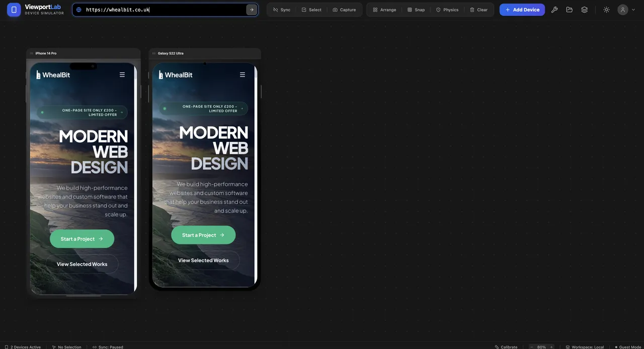
• Multi-Device Synchronization: Scroll, click, and navigate on one device, and watch all other viewports mirror the action in real-time.
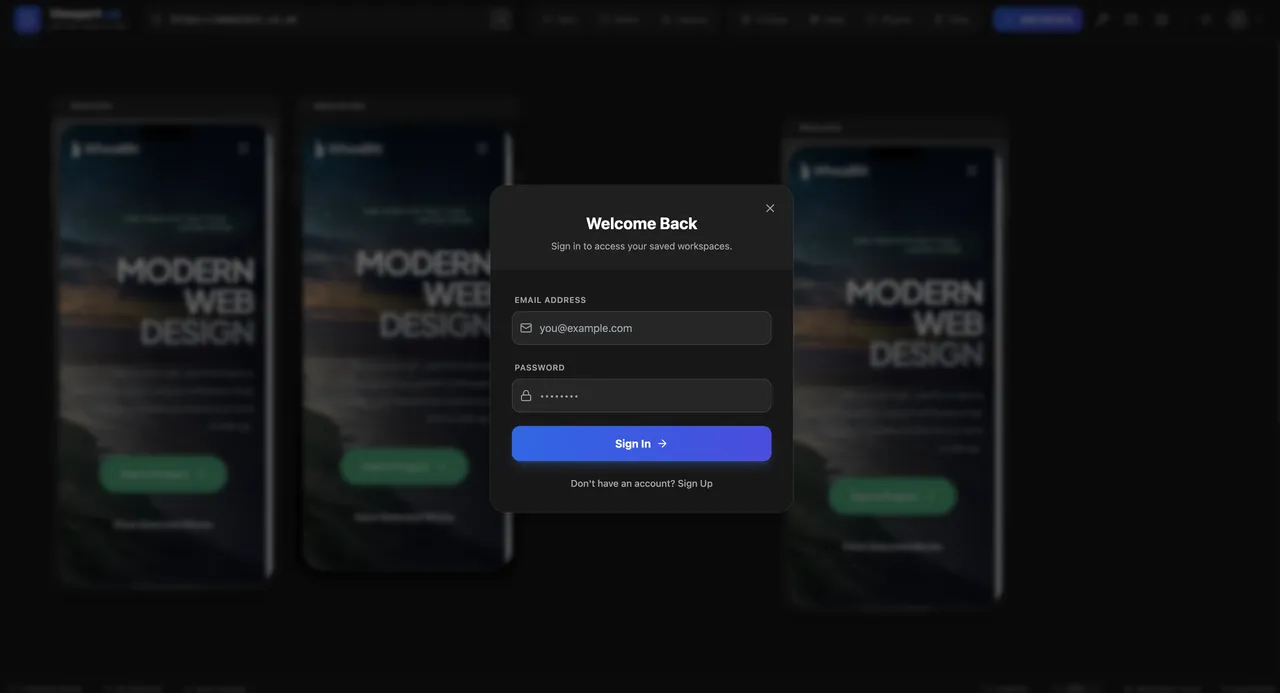
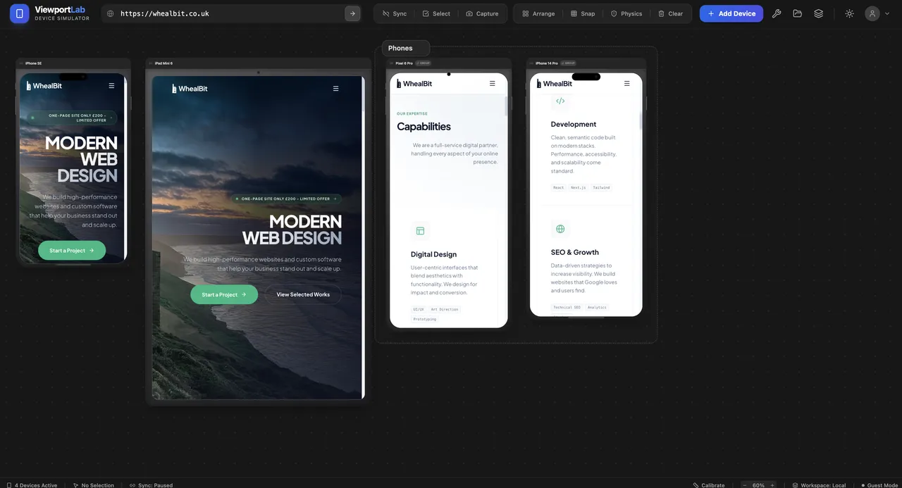
• Dynamic Device Library: Users can instantly add popular presets (iPhone 14 Pro, Pixel 8, iPad Mini) or define custom resolutions.
• Workspaces & Persistence: A secure authentication system allows users to save specific 'device clusters' for different projects, eliminating repetitive setup.
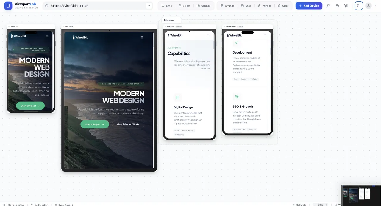
• Intuitive Canvas UI: A 'Physics-based' layout engine that allows users to arrange, snap, and organize viewports on an infinite grid.
Technical Deep Dive:
1. The Proxy & Rendering Engine
The core challenge was overcoming X-Frame-Options and CORS restrictions that prevent many sites from being loaded in iframes. We implemented a custom proxy server to bypass these headers while maintaining session security.
2. Event Mirroring
To achieve 'Sync' mode, we utilized the PostMessage API to broadcast DOM events from the 'master' viewport to all 'slaves,' ensuring that the state remains consistent even during complex animations.
3. Performance Optimization
Rendering five or more high-resolution viewports simultaneously can be memory-intensive. We optimized the app by implementing Lazy Loading for viewports outside the visible canvas and using CSS hardware acceleration for smooth canvas panning.
Project Details
Technology
Performance
Visual Details